
I recently had a colleague ask me to put on a graph the way I like to assess the IVC, at least conceptually. I posted about this a few weeks ago (http://wp.me/p1avUV-8E), so I tried to come up with something useful for clinicians, correlating IVC variation with respiratory effort.
A useful concept to visualize this is the Effort-Variation Index (EVI). To obtain this, start by looking at a Frank-Starling curve, and broadly categorizing patients as being on the “empty” side, the “normal” or the “full” side.

Next, if you look at how these groups would plot on a graph correlating IVC variation to respiratory effort, which, physiologically, would be the change in pleural pressure (delta Ppl), you should conceptually see something like this:
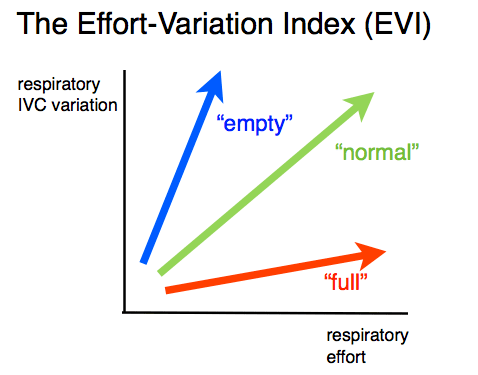
Note that this has not been validated, nor does it contain any values. It is simply, for now, a useful mental construct to understand the physiology behind the variability, and is useful when elaborating each patient’s physiological profile in the mind of the bedside clinician. Along any horizontal line, the IVC variation would be the same. You can therefore see that, given enough respiratory effort, a “full” patient could appear “normal” or even “empty.” Hence interpreting IVC variation without understanding this would lead to potential error.
Love to hear some thoughts and comments!
Philippe